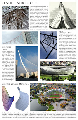
This layout for our structural sheet came out much cleaner when using InDesign and was much simpler edit picture sizes and fit them in an organized way. I am still having some trouble with spacing the the image is not a perfect rectangle (bottom left) and there is white space around it. What kind of solutions did you have for instances like this?
1 comment:
i like how the layout draws your eyes back and forth as you go down the page
what font is that your using?
Post a Comment