Thursday, November 20, 2008
Tuesday, November 18, 2008
Thursday, November 13, 2008
Tuesday, November 4, 2008
Thursday, October 30, 2008
Tuesday, October 21, 2008
Monday, October 20, 2008
Thursday, October 9, 2008
Wednesday, September 24, 2008
Thursday, September 18, 2008
Tuesday, September 9, 2008
Tuesday, September 2, 2008

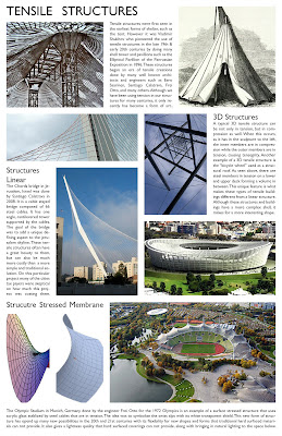
This layout for our structural sheet came out much cleaner when using InDesign and was much simpler edit picture sizes and fit them in an organized way. I am still having some trouble with spacing the the image is not a perfect rectangle (bottom left) and there is white space around it. What kind of solutions did you have for instances like this?
Friday, August 29, 2008

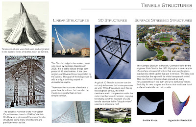
The original layout was intended to have a title, a general history column to the left, with three subsequent columns to the right that broke down the general ideas into smaller categories. The main problem with this original layout was that it was a little too busy and the text appeared to flow throughout the entire layout, rather than being noticeably attached to the photo or diagram in which it was displaying.
Subscribe to:
Posts (Atom)


