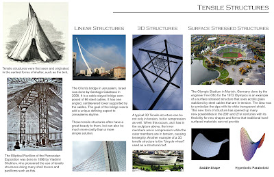
The original layout was intended to have a title, a general history column to the left, with three subsequent columns to the right that broke down the general ideas into smaller categories. The main problem with this original layout was that it was a little too busy and the text appeared to flow throughout the entire layout, rather than being noticeably attached to the photo or diagram in which it was displaying.

